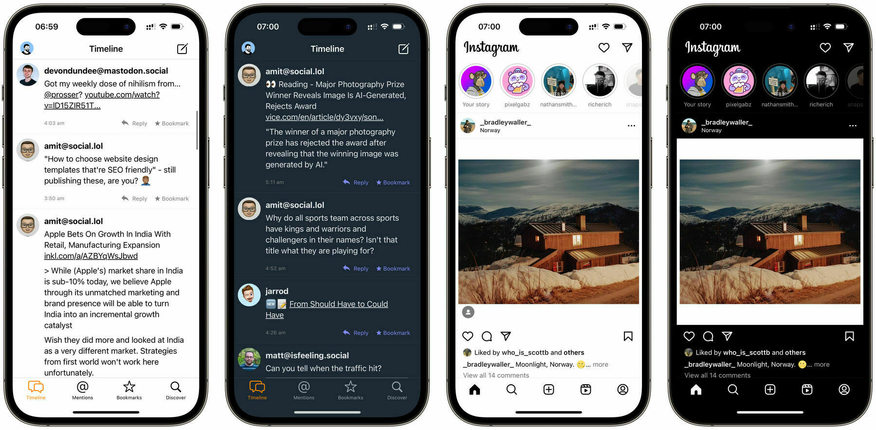
Since the launch of dark mode in iOS I don’t think I’ve disabled the feature other than testing. I’ve never been a fan of the constant white used in modern iOS and, although debatable, it saves a bit of battery life by switching off pixels. However apps that don’t customise the way dark mode looks really suck.
There’s much more personal preference that’s needed once you flick the switch to dark mode. Some apps opt for replacing the glaring white for simple black. While others go for dark shades of blue or grey instead. Meaning that apps can show their personality and make theirs stand out, but not always to taste.
Take the above examples of the upcoming 3.0 update to the micro.blog app and Instagram. One of my most used apps micro.blog uses a not very dark blue colour which is not to my taste at all. I’d much prefer the black of Instagram for the app background and this is where dark mode triggers much more personal preference.
Is it enough for me to stop using the app, no, but it’s enough to make me think almost every time I open it that I wish I could change it. Couple this with having a look at Bluesky and thinking their app looks great, I switched into light mode for a bit and what a refreshing change it makes. I’m still not convinced with all the white burning my eyes, but it takes away all these personal preferences and leaves me with good looking apps.
Thankfully a lot of apps give you the option to pick and choose, or even theme the way the app looks. The excellent micro.blog app Gluon gives you the choice to switch to an OLED friendly black background. Drafts, the well liked app for all of your text even offers customised themes and a selection of downloadable options. I just found it strange that I don’t really care about every app using white, or slightly off white, but when it comes to off black - yuck.

Leave A Reply Instead?
Read Comments (0)