One of the biggest complaints I had at the time I chose to remove the iPad from my workflow was the constantly changing nature of it. Each time Apple updated the OS they slightly changed, or completely revamped, the way multitasking and other things worked. When you use and rely on something as much as I did my iPad, it gets frustrating quickly. Unfortunately, they have now done it to the Apple Watch, and I’m pulling out what little hair I have.
I am aware it beta software, so everything could change, but watchOS 10 changes the core functionality so much that I doubt it will all of a sudden roll back these changes. This isn’t uncommon for Apple either, way back in 2017, I was frustrated at the inconsistency on what a swipe does on different iPhones. Now it is my muscle memory that has been forged by many years of having these things strapped to my wrist.
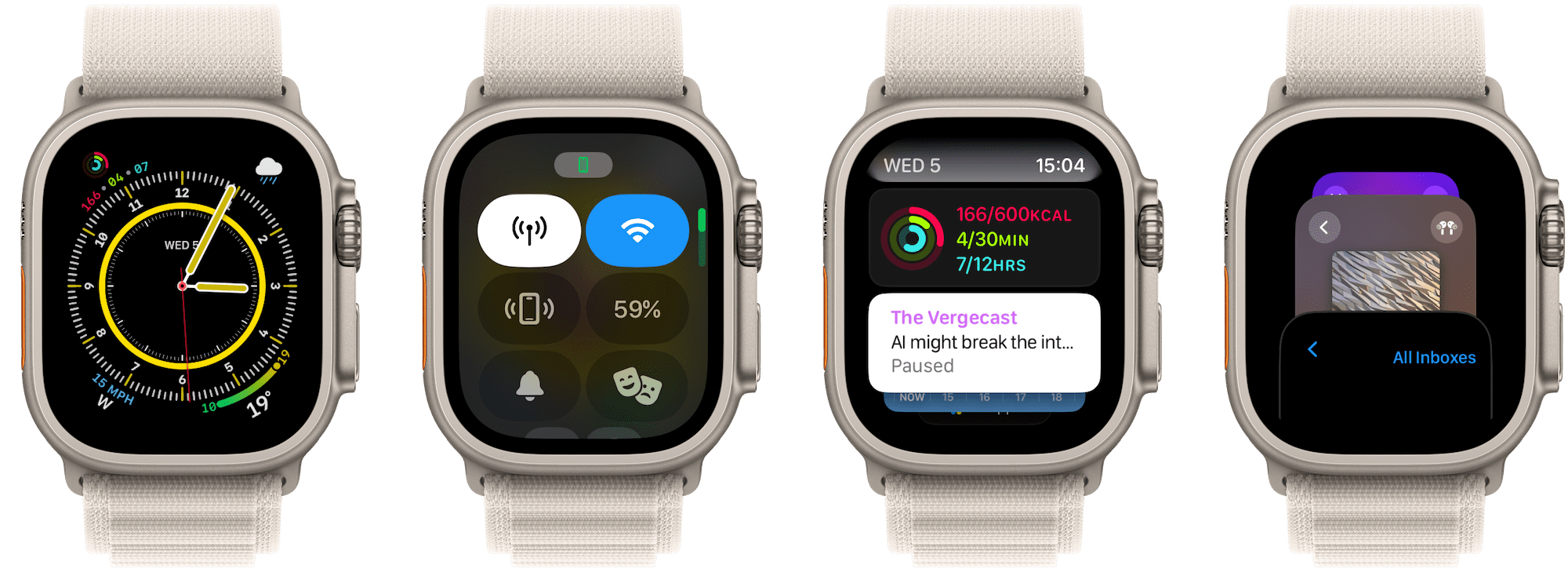
I don’t even dislike the update, a lot of it makes sense, it’s more of the jarring UX change. I keep swiping up from the bottom of the screen, something I have done thousands of times to access Control Center, and it now shows me widgets. Widgets that, excuse me for being an old man shouting at clouds for a moment, I have absolutely no need of!
I fell in love with the Apple Watch, much like I did the iPad because it was simple. It did exactly what I required. Told the time and gave me the health tracking needed. Now I just feel a little out of touch, as if it is watchOS 1 and Apple thinks I am going to send my heartbeat to other people again. I hope that watch OS doesn’t suffer the same fate as iPad OS and forget exactly what it is, and how simple it should be.
Accessing the dock of apps is now double press the crown, and turning it also accesses the aforementioned widgets. I like change, I love change for a reason, but this feels like change for change’s sake. The new animations do look nice though!
Leave A Reply Instead?
Read Comments (0)