Micro Social 2.1
As I wrote about at launch (which was only 18 months ago!) I wanted to build an app that gave me a different to use micro.blog. Something that felt more customisable, modern, and streamlined, while still staying true to the simplicity of the platform. At first, this was just for me, roughly hard-coded with my access key and sloppily adding features as I came to them.
It got out of control fast. Within 3 weeks of deciding to try to launch this app for others to use, I'd built something that I was happy with and pushed it out. Lots broke, people helped me resolve issues and many more people supported the development of the app. I become obsessed with building smart features that solved real issues people had, and at points the work got in the way of other things in my life.
I got to a place I was reasonably happy with at v2.0, and left it at that. I drifted away from using the web much at all, and apart from fixing major things I left Micro social as it was. Users dwindled away, no one really knew the app was there so it became stale.
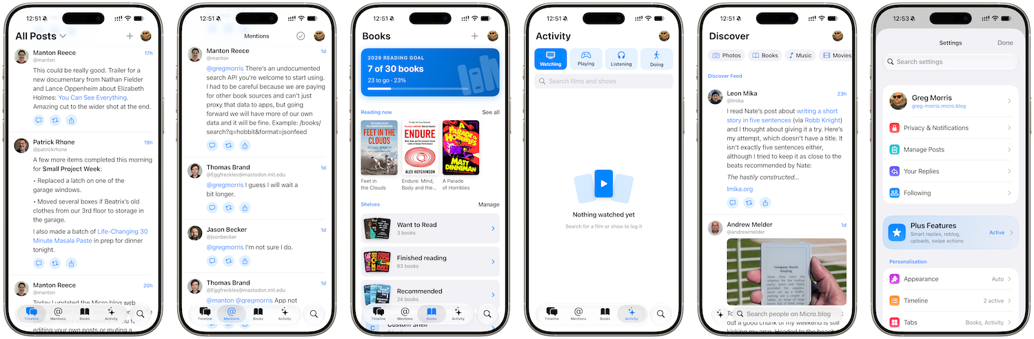
I became busy building other things, which was a distraction but has actually given me the motivation to really push Micro Social forward and make it the best app it could be. Almost every screen in 2.1 has been redesigned and updated to make interaction easier, improving the look and feel of everything you do within the app.
Discover
Discover is a proper place to find things now. The topics are chips along the top. Tap one and its posts fill the screen under a banner for that topic, tap it again, and you are back to the Discover Feed.
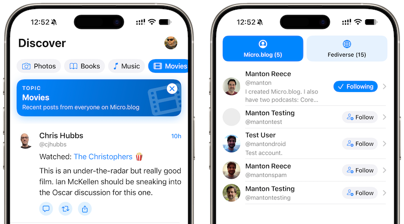
The tab's search field finds people on Micro.blog by name or username, split into Micro.blog accounts and accounts pulled in from the fediverse, with a Follow button on every row.
Books
Books is the screen that needed the most help, and it is the one I am happiest with. Your reading goal is a solid card at the top with a big count and a thick bar. Shelves show fanned covers.
More than this thought, adding a book now searches Micro.blog's own catalogue, so the results are the books people on Micro.blog actually log, with the same covers you see on their posts.
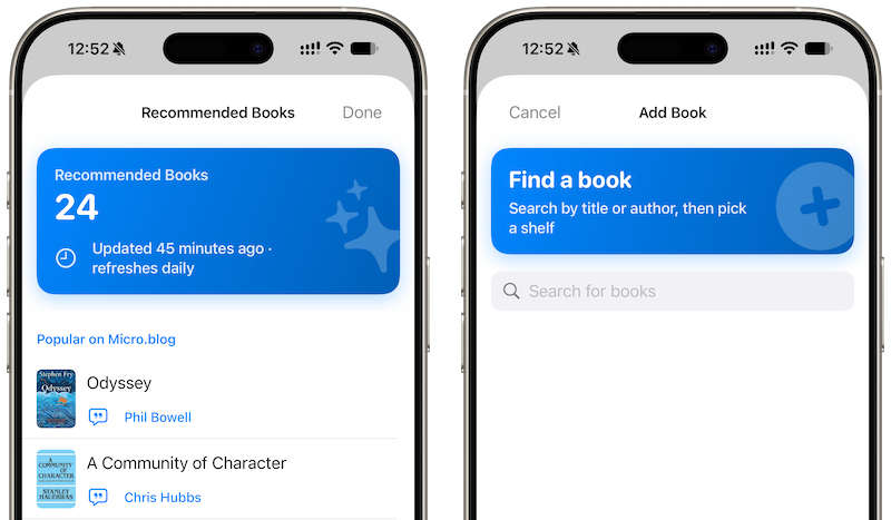
Recommendations are available for Plus users which are pulled from the books people are posting about on Micro.blog, credited to whoever posted them with a link to their post, and then what is trending on Open Library this week. They refresh themselves the first time you open books each day and never suggest something already on your shelves.
Posting
The composer is the thing I use most, so I ditched everything and started again instead of tacking things on. Now featuring a full screen with your blog as a small chip in the header and a bar above the keyboard for photos, a title, and the extras that used to be buried.
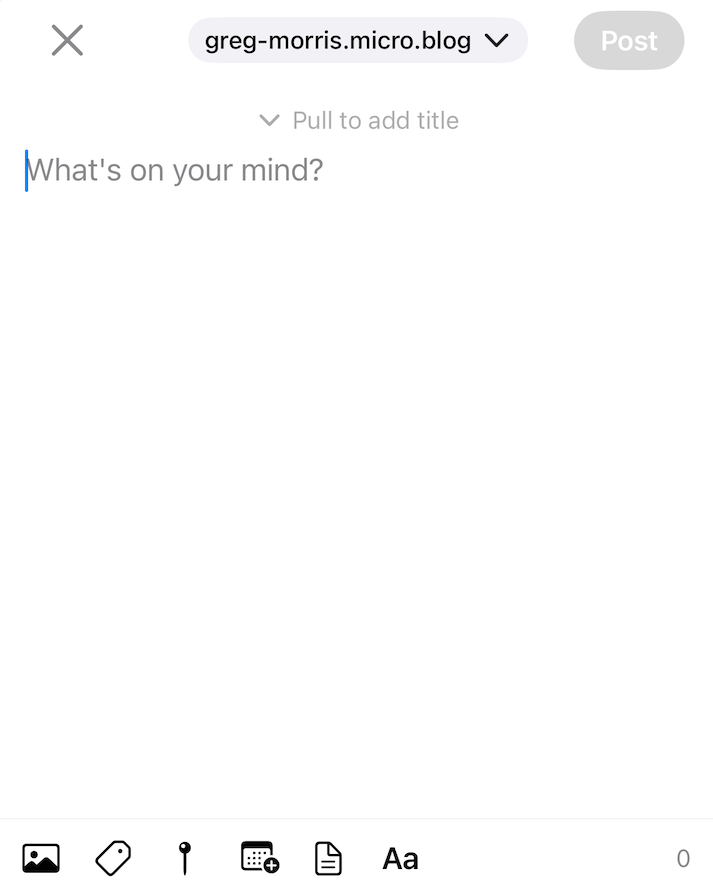
Photos sit in a strip under the text. Alt text opens as a card the first time you add an image rather than a screen you have to go looking for. Long press Post and you can save a draft. Replies open in place from the post you are replying to, with the people in the conversation already worked out for you. It is quieter than before and gets out of the way faster.
The small things & New Features
There are loads of other little tweaks that I thoroughly enjoyed improving and thinking through to create a present experience all around. Lists open with what they showed last time and refresh behind. Posts go edge to edge for more room to see them, and interaction elements are displayed underneath them.
iPad users now get a sidebar layout, animations are improved, settings now makes sense and there less clutter but more customisation, and you’re more informed about what is going on with walkthroughs and toast messages than ever before.
There are quite a few new features I also have in the works that won’t make it into 2.1, but will be very near behind, so testing is something I am in need of. Unfortunately, the tip jar one off payment model for supporting development has not worked over time. I am contemplating reviving a supporters model and letting them test things first; however, this needs some further thought and feedback from current users.

The blog of an obsessive notetaker and over thinker